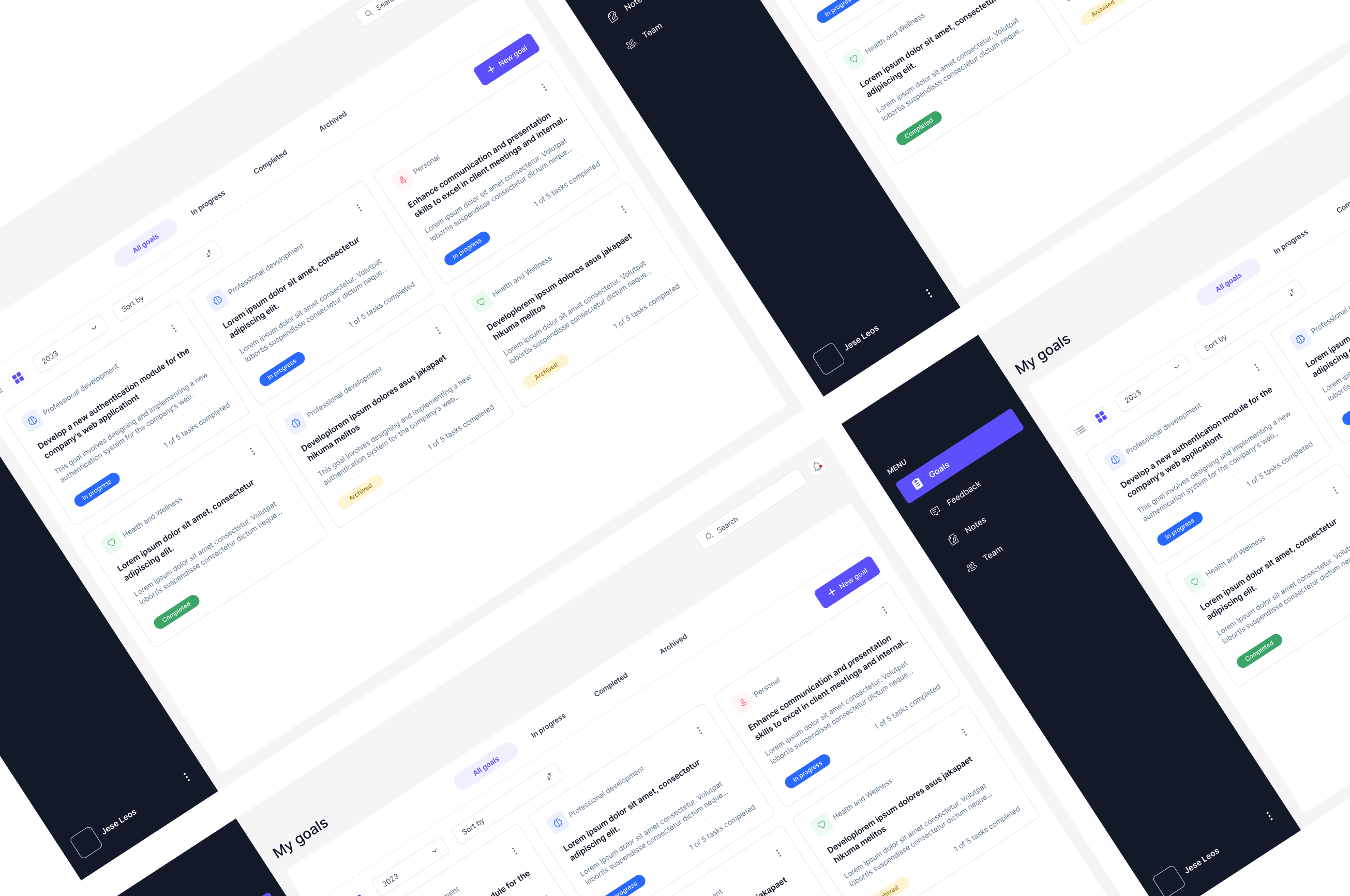
Employee Dashboard
Employee Dashboard: Intern Project with SvelteKit and Tailwind CSS
My Internship at Netcetera
I recently completed an exciting internship at Netcetera, where I worked closely with a team of talented professionals to develop impactful digital solutions. This experience provided me with invaluable insight into collaborative design and development processes.

Overview of My Role
During my internship at Netcetera, I worked on developing user-centric web applications using modern technologies like SvelteKit and Tailwind CSS. One of my main responsibilities was implementing the Employee Dashboard, where I turned the provided design into a fully functional front-end. This experience allowed me to contribute to real-world projects while learning best practices in UX design, coding, and project collaboration.
Tools and Technologies Used in the Employee Dashboard
- SvelteKit: A modern web framework that made the development process faster and smoother.
- Tailwind CSS: A utility-first CSS framework that helped me create responsive, custom styles without writing traditional CSS.
- ShadCN: A component library that provided accessible and reusable UI components for the project.
- Lucide: An icon library that I used for implementing consistent, scalable icons across the dashboard.
- Jira: Used for project management, ensuring that all tasks were organized, assigned, and tracked throughout the development process.
- Bitbucket: A Git-based repository hosting service that facilitated version control and collaboration, allowing for code reviews and tracking of changes during development.

What is the Employee Dashboard Project?
The Employee Dashboard is a tool designed to help team leaders and employees set, track, and achieve their professional goals. It provides a way to manage goals, receive feedback, track team progress, and document important notes—all in one place. The core idea behind the Employee Dashboard is to make goal management and performance tracking easier for both employees and their team leaders.

Team Leader can:
- Set and manage their own professional goals.
- Track the progress of goals of their team members.
- See feedback from others on their performance.
- Suggest promotions based on individual progress and performance over time.
Team Members can:
- Set their personal goals, receive feedback, and write important notes.
- Collaborate more effectively with their team leaders and team members.
- Stay on top of their own career progress.
Recognizing and Building Components
Identifying Components
Carefully studying the design to identify all reusable components, such as buttons, cards, tooltips, badges, input fields. etc. This was essential to ensure consistency and reusability across the entire application.
Creating the Page Layouts
After building the components, I integrated them into the layout of each page—for example. Each page was constructed by composing the individual components into a cohesive design.
The following image shows a few selected components from the project, out of many available, highlighting specific elements to showcase their functionality and visual design within the overall dashboard.

One of the more challenging tasks I faced during my internship was building the card component for the Employee Dashboard. Although the designs were provided by a talented designer, it was up to me to bring these designs to life using SvelteKit and Tailwind CSS. The card component was a crucial part of the application, as it needed to be flexible enough to handle multiple use cases like goals, feedback, team progress, and notes.
Developing the Card Component
The card component was designed to be adaptable, so I built it with three main slots:
- Header:This section was used for titles or key labels like the goal category, team member's name, or other identifying information. It also included action buttons dropdowns, etc. which allowed users to manage the content directly from the card.
- Main Content: The main body of the card, where detailed information like descriptions, feedback messages, or notes would be displayed.
- Footer: A section dedicated to extra details such as progress indicators, timestamps, action buttons etc.
The image below represents an overview of a few of these card components in action, showcasing their different states and adaptations.

Adding Flexibility with Props
I made the component even more adaptable by introducing props that controlled its behavior and appearance. For example, a prop could show or hide the progress bar on a goals card or display for example a status label like “Draft” or “Expired” on a feedback card. This way, the same base component could serve different purposes, depending on the data passed to it.
Tailoring for Specific Needs
- Goals Cards: These cards needed to display the goal’s title, description, and current status. I used Tailwind CSS to style status labels like “In Progress” or “Completed” so that users could easily recognize them.
- Feedback Cards: This was a bit trickier as feedback cards could represent different states.Using conditional rendering in Svelte, I could dynamically adjust the card's appearance and content based on the feedback status. This setup ensures that users can quickly identify the feedback type and act on it appropriately.
- Team Cards: Team cards focus on displaying key information about team members and their roles. These cards include slots for names, titles, and feedback summaries. Using Tailwind CSS’s utility classes, I applied consistent spacing, typography, and color schemes to maintain a professional look.
- Notes Cards:Notes cards include a header for the note title, a main content section for the note's body, and a timestamp to track the last modification. The flexible layout ensures that these cards can adapt to varying amounts of content without breaking the design.
Ensuring Consistency and Reusability
Consistency was crucial for the dashboard’s overall user experience. I studied the designs carefully to identify common patterns and elements, such as buttons, icons, badges, etc. By developing these as separate, reusable components, I was able to integrate them into the card and other parts of the dashboard, streamlining development and keeping the UI cohesive.